After completing the developmental workshops, I was ready to start thinking about what my FMP should be about. I decided not to go with any of the 3 ideas from my pecha kucka, as I didn’t feel particularly passionate about any of them, and I wanted to make something I’d have fun with. I knew by now that I wanted to create a story where nobody was particularly a hero or a villain; I wanted a story about characters who disagreed with each other based on their own ways of life and beliefs, and in the end would realise that there’s more than one way to do things and that we shouldn’t be too stuck in our own heads. I’ve been struggling with issues related to this concept in real life as I get older and find my own way to do things, so I felt passionate about communicating the message through film.
At first, I considered creating a parent-child themed animation, and I had two ideas; one about a creative child and a strict parent who wants them to focus on other, more traditional and academic things, and one about a magical father and son who disagree on what the best way of making magical flowers is ahead of a magical flower competition, with the former having a more traditional approach and his son being more abstract. I decided not to go with either of these ideas, as I already created an animation with parental themes last year, and I didn’t want to do the same thing twice.
I eventually remembered an idea I had thought of prior to the project for an animation that I intended to make in my free time; a fight between two princesses who are very opposite, with magic powers. I thought that with some tweaking and narrative added, this idea could be a fun one to make and watch; something comedic, but with a meaning present.
After some thinking, I came up with the idea for my fmp; ‘sweet chilli’. It would follow two young chef girls who disagree on what the secret ingredient to their curry should be, ahead of a visit from a restaurant reviewer, combining elements of the ideas I mentioned prior. In the end, they’d add both ingredients, and realise that combining their ideas results in something new and more unique. I chose curry as the dish they’d make as it’s something that can be prepared in a lot of different ways throughout a lot of different cultures, so it would make sense for the girls to have opposite ways of preparing it.
Visually, I wanted something a little more abstract and ‘kitsch’; Something that could be seen as a bit tacky or odd looking to some, but was created with intention and appeals to more lowbrow and unorthodox tastes. I’ve recently been experimenting a lot with mixed media, sketchy lines and different styles of animation, as a way to make my work more unique and identifiable. I knew that I wanted this film to follow the fundamentals of my recent artworks; Real life imagery and cartoon drawings would be combined, and the animation could become choppy/distorted if I felt it communicated my ideas better than a more traditional approach would. As with my other films, it would have a young target audience.
I started off by brainstorming about what I wanted my characters to be like; in the princess fight animation I imagined, I intended to have one character be very delicate and prissy and the other be more of a rowdy tomboy, and I carried this dynamic into this film as I felt it was a fun one to work with, and would clearly set my characters apart from each other. Following in the theme of food, I would make the softer character a chef who usually works with sweet ingredients, and the rowdy one a chef who favours spice.
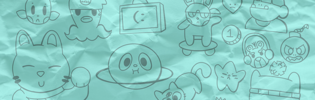
I started my character design process with a moodboard for the spicy chef. I knew she’d be a girl, but I wanted her to have a rougher and more androgynous appearance over a particularly feminine one. I took a lot of inspiration from China, and in particular the province of Sichuan, known for spicy dishes. Her face would be inspired by traditional Chinese theatre masks; bright colours and strong expressions would be present. Shape wise I wanted her to have rough edges and spikes; I took inspiration from the ‘Shamate’ Chinese punk fashion style in this regard, and knew she’d probably have sharp and unnaturally coloured hair. I also wanted to incorporate ox horns into her design, as a reference to the bull demon king in the story ‘journey to the west’; a villain in a Chinese fairy tale who is capable of creating flames that nobody can put out. I wanted to incorporate as many traditional Chinese features into her design as possible; I’d try to incorporate symbols, and things like Buddhist mala prayer beads, which are pictured above. Her colours would be inspired by fires and chillis; shades of yellow, red, green and orange.Following in the method from my workshops, I broke the character design process into heads and then bodies. I experimented with combining chilli peppers into her design through her hat and hair; I preferred her having a chilli shaped beanie to chilli pepper hair, so I tried hats in most of her designs. I decided to do away with her horns, as I thought that both horns and spiky hair were a bit excessive. To give her a more mask like facial appearance, I gave her facial markings and permanently closed eyes. I included a tag with the pinyin symbol for ‘ox’ on it, to keep some ox influence in her design. The tag on her hat is also a reference to ‘Jiangshi’, or Chinese vampires, which typically would have a hat with a magical seal on it to keep them dead.Next, I tired out costumes for the character. I thought she’d be the type to wear something loose and easy to move around in, so I went with a skater style for her outfit concepts, which I feel works well with her face. I considered a tail for her, but did away with it as I felt it would complicate animation. In the end I decided on a simple T shirt and shorts for her, and a stubby, boxy build, with mala beads around her wrist.Finally, I tried some colour concepts for the character, mostly using vibrant shades of red contrasted with some darker colours. I liked the bottom left the most, as it felt unique and fitting for the character, and I was able to use a lot of red without making it excessive. I named the character ‘Scoville’, after the Scoville scale which is used to measure spice, and created a character sheet for her finished design. I was happy with this design, as I felt her influences were incorporated well without feeling out of place. I came up with a little back story for her; she’s the daughter of the ox king, although she’s always been mistaken for a boy (a reference to the fact that he has a son in the original story). She’s capable of breathing flames, and is determined to achieve world domination along with her parents; in the mean time, though, she enjoys working at curry and co as a head chef.After Scoville, it was time to create the sweet chef, who would have an adversely feminine and soft appearance in comparison to the former. I considered the names ‘pink lady’ and ‘lady sucrose’ for her, before settling on ‘Lady Saccharose’, saccharose meaning sucrose (or table sugar) in French. Her influences were a mix of girly characters in media I liked the designs of, such as princess peach and lalaloopsy dolls, along with traditional French aristocratic ladies from the past. In particular I wanted to draw inspiration from Marie Antoinette, the last French queen, who famously told her subjects to ‘let them eat cake’ upon being informed that the people of France were starving and had no bread; I thought that the cake reference worked well for a character who loved sweets. In contrast to Scoville, I wanted lady saccharose to be made up mostly of round shapes. I experimented with a few things in terms of the design for her head; I tried a cupcake hat to match with Scoville’s hat, before switching it out for a crown or a bow. I wanted her to have big puffy hair, in reference to Marie Antoinette. I also decided to give her, and the rest of the characters, closed eyes; I thought it would be a fun challenge to have all of my character’s eyes closed and rely on their bodily movement for communication and acting. After settling on a bow and puffy dress for saccharose, I moved on to her outfit. I didn’t spend long here because by now, I knew I wanted her to wear a puffy princess dress. She’s a little chubbier in build than Scoville, her body made up mostly of circles.I tried a few colour palettes for Saccharose, mostly utilizing the colours pink, purple and white, as they were present in her moodboard. I also went with the bottom right design in this case, opting for a soft pink and peach palette. Her backstory is that she’s a princess from a far away land made completely of curry; seeking some excitement outside of her mundane castle life, she has found a job as a head chef at curry and co, and usually keeps her status a secret.And with that, I had the designs for my main characters. Next, I moved on to designs for minor characters, starting with the girls’ boss who would give them the command to work together.As curry is a dish originating in India, I chose Indian influence for the boss’ design. I hadn’t yet figured out if they would be male or female, but I settled on male to balance out the genders of the characters in the film. I looked at traditional Indian dresswear for his influence, as well as some traditional symbols like lotus flowers and tigers. I also wanted to incorporate ‘the star of India’, a giant sapphire with a distinctive white star inside of it, into his design, as I found it cool. I settled on the name ‘Aloo Gobi’ for him, a traditional Indian cauliflower dish with a distinctive yellow colour, and decided that this would be his main colour moving forward.Next, I tried some concepts for Aloo’s head. I liked the idea of a small tiger being present on his head; I decided to name the tiger Gobi, so their names together became Aloo & Gobi. I tried a few things for his design, but eventually decided on giving him a turban, a long beard, the star of India on the front of his turban and an eyeball on his forehead.I gave aloo a wide and boxy build to contrast him against the girls, and tried out a loose fitting jacket with a lotus flower on it for his outfit. I then tried some different colours for Aloo and Gobi. Staying true to the dish, aloo has yellow skin; I decided on the 2nd idea from the bottom left, as I liked the contrast between the purple and yellow.With that, the boss of the restaurant was created. Aloo’s backstory is that he was once a poor and sickly man, living in a poor neighbourhood. No matter how hard things were for him, he’d work his fingers to the bone so that he could afford to buy ingredients to cook curries; once cooked, he’d share them with his people, barely keeping any food for himself. One day, Aloo had finished handing out his curries, and had a small bowl left for himself; he saw a cat starving on the side of the road, however, and decided to give him the curry instead. The cat was then revealed to be a tiny tiger god, who granted aloo with magical powers as a reward for his selflessness; the two became best friends and eventually achieved success with aloo’s cooking skills, rebuilding their neighbourhood and moving away to start a curry restaurant of their own. Aloo’s passion for cooking and sharing gives him the patience to put up with his bickering head chefs.Next, I designed the restaurant reviewer. I knew that I wanted them to be small and mean looking, as I felt it would be funny to have them be someone terrifying despite their tiny build. I liked the idea of them having a small figure and big eyes, like a tarsier.
I moved on to concepts for the reviewer’s head. I liked the idea of the character being female, not for any particular reason, so I went with feminine head designs. Initially I wanted her to look young and cute, but while experimenting I came to like the idea of her being a small old woman, as they’re usually depicted as sweet and kind, so she diverted expectations a bit. I gave her big glasses, and big hair; I came to like the onion shaped hairstyle that I had come up with, and decided I’d use it moving forward.
For the body, I decided to also give shallot a wider and boxier build. I gave her a suit and tie, to visually communicate that she was someone with status and power.For colours, I knew I wanted her to be green and white, like a spring onion. I settled on the last on the bottom row of these palettes, as I felt it was the most coherent.With that, the character who I named ‘Shallot charlotte’, eventually shortening it to just shallot, was created. She’s an alien from a planet of food reviewers, named onion X, who visit earth to check out restaurants that are gaining traction and try them out.After some discussion with my teacher, I thought it would be a fun sub plot to have Gobi chase a mouse around the restaurant, their relationship mirroring that of the girls. I created this mouse character, Mont blanc, to fulfil that role; a small city mouse who often takes up residency in local restaurants, unfortunately taking refuge in one that contains a cat.
With my characters finished, I designed the curry and co restaurant, and the world around it. Following my intention to create something ‘Kitsch’, I went with a roughly drawn style for the backgrounds, with boiled lines and clashing, rough colours. I liked the idea of the restaurant being shaped like a bowl of curry itself; I decided to use a png of a real bowl and draw on top of it for the restaurant’s exterior. I combined different textures, real and hand drawn, into the background, something I wanted to experiment with throughout the film. I lastly came up for some concepts for the kitchen that the girls would work in; I thought it would be a cool idea to have them initially work in a split kitchen, and then for the kitchen to magically transform into a cooperative one when they had to work together. I carried the mixed media style through here too.
With that, development for sweet chilli had started, Next, I needed to figure out the story, and make any changes recommended upon presentation.